POU Food Truck
Focused on advertising to a youth and young adult audience, POU is a food truck that sells churros inspired by poutine AKA churros smothered in sauces and toppings. This was a student project.
Roles
Branding
Illustration
Focused on advertising to a youth and young adult audience, POU is a food truck that sells churros inspired by poutine AKA churros smothered in sauces and toppings. This was a student project.
Branding
Illustration
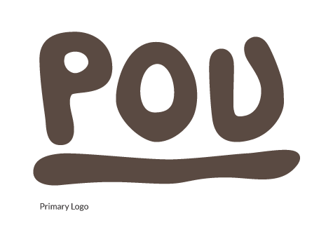
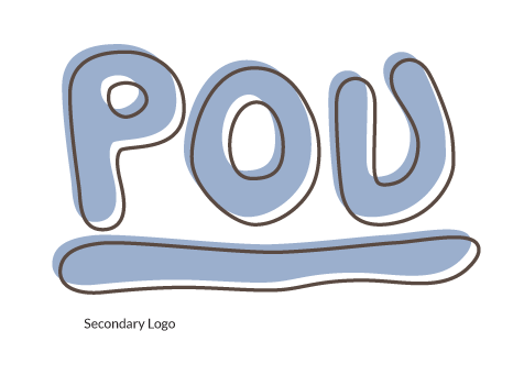
POU is cheeky and playful. The logo conveys a lot of that sentiment; it is friendly, organic, and rounded, playing off of the heaps of sauce you would expect with a typical plate of pou. The secondary treatment with the offset outline emphasizes how its also messy; POU doesn't take itself too seriously and won't color within the lines.
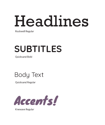
Conceding that out concept was a bit unconventional meant really making sure that the brand evoked the lightheartedness we meant it to have; there's a fine line between crass and amusing, and we had to tread carefully. We opted for cool colors, blue and purple, to brighten up our larger brown and tan palette; these colors would be reminiscent of the cold nights we imagined would be perfect for a hot plate of steaming pou.

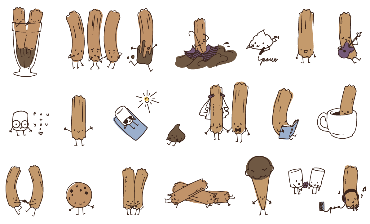
Selling the concept was key, and what better way to get people on board than through adorable mascots? I created a community of little pous, marshmallows, and more, and these compelling illustrations would be instrumental in onboarding those who might be dubious about the idea at first. (Some might even say that they make the pou a little easier to digest...) These animated little characters bring charm and delight, inviting customers to come and learn more about their little world.
Utilizing organic blob shapes and a generous application of the animated characters, POU comes to life, eliciting laughs and groans and piquing interest, all the while providing a palatable and noteworthy experience.
