Logo
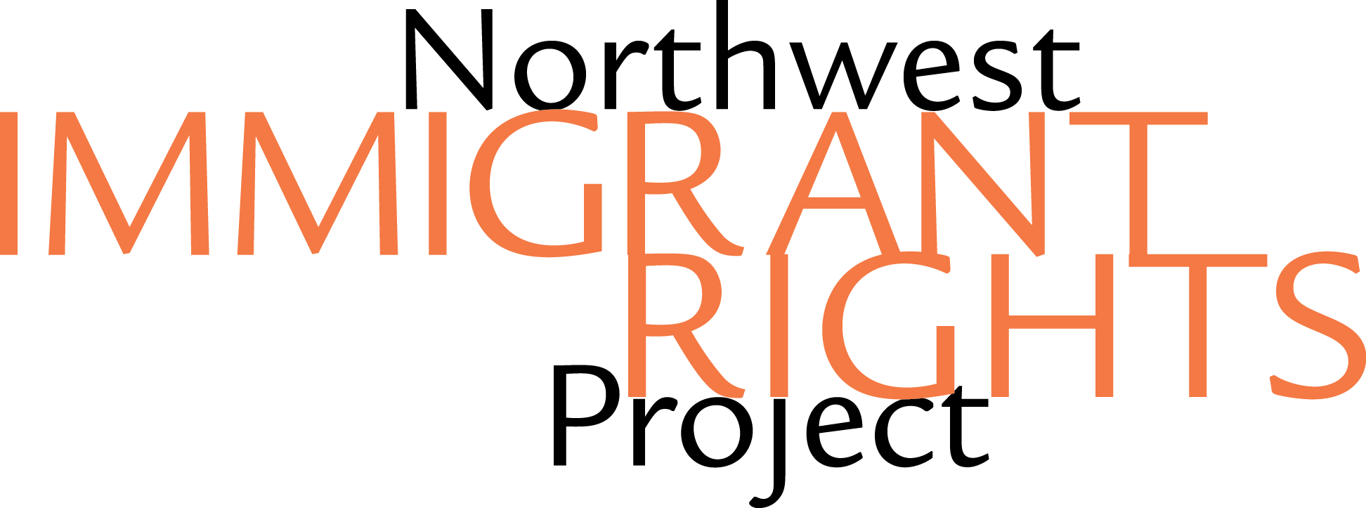
Northwest Immigrant Rights Project has a name that can be difficult to parse easily, especially considering that their target audience includes people from a wide range of backgrounds. Since the organization is such a critical resource for this community, we wanted to make sure that their logo was legible, recognizable, and relevant. We opted to create a logomark, in order to make the brand more recognizable even across a number of languages, and we stumbled across the butterfly, a symbol for migration and transformation. Pairing it with a open, professional sans serif typeface, we tracked out the letters to give the stack of letters a better rag.
Brand Application
Since NWIRP is such a productive organization, we wanted them to be able to create more dynamic layouts within their brand. We introduced a slant that could be applied to color fields to break up all the information they want their audience to receive. We brightened up their iconic red and orange to give the brand more energy, and we continued to use Helvetica Neue, their existing typeface, for all their copy.
Print Collateral
NWIRP's primary touchpoint with the public is through print collateral; they provide information at volunteer and informational events, through the mail, and at the detention center. We wanted to make sure that this material would be easy to understand but was also heartfelt and communicated a sense of progress, hope, and community.
Website
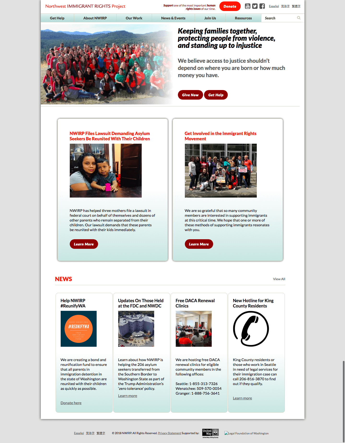
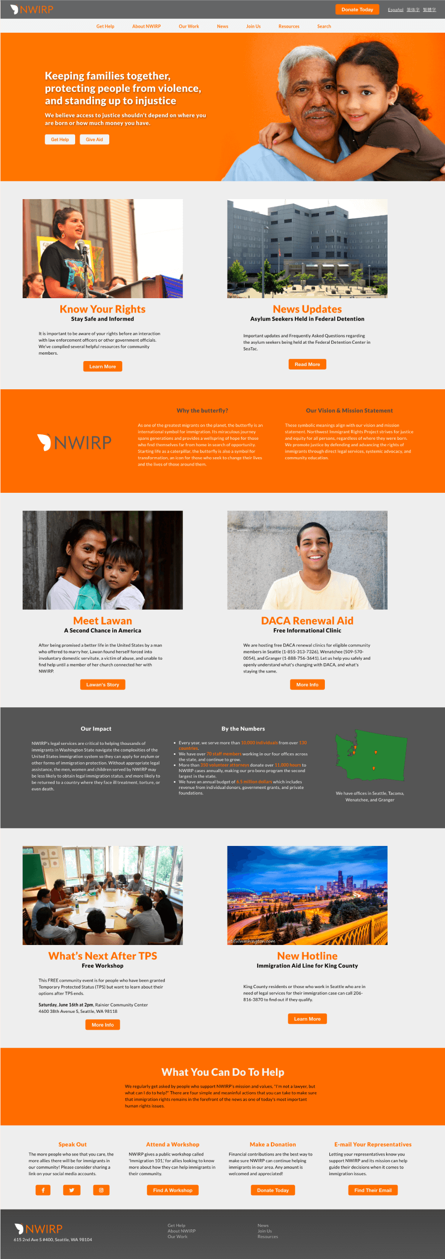
The primary concern we had for the current website for NWIRP was that it is difficult to navigate; the sitemap is extensive and overly complex. Primary users for the site would be people looking to donate their time or money; they would look to the landing page to see what NWIRP does and whether or not they're a worthy cause. Our primary objective of a redesign would be to improve the informational hierarchy and make it easier to find information. Mara Stokke was in charge of web design and development.


