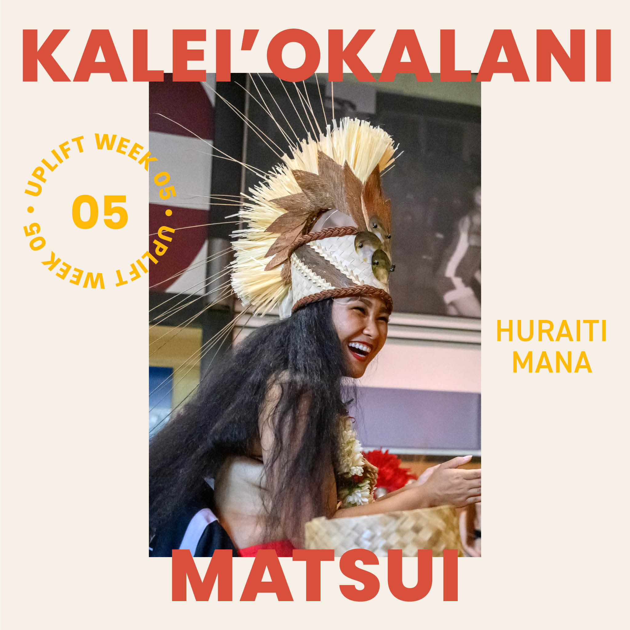
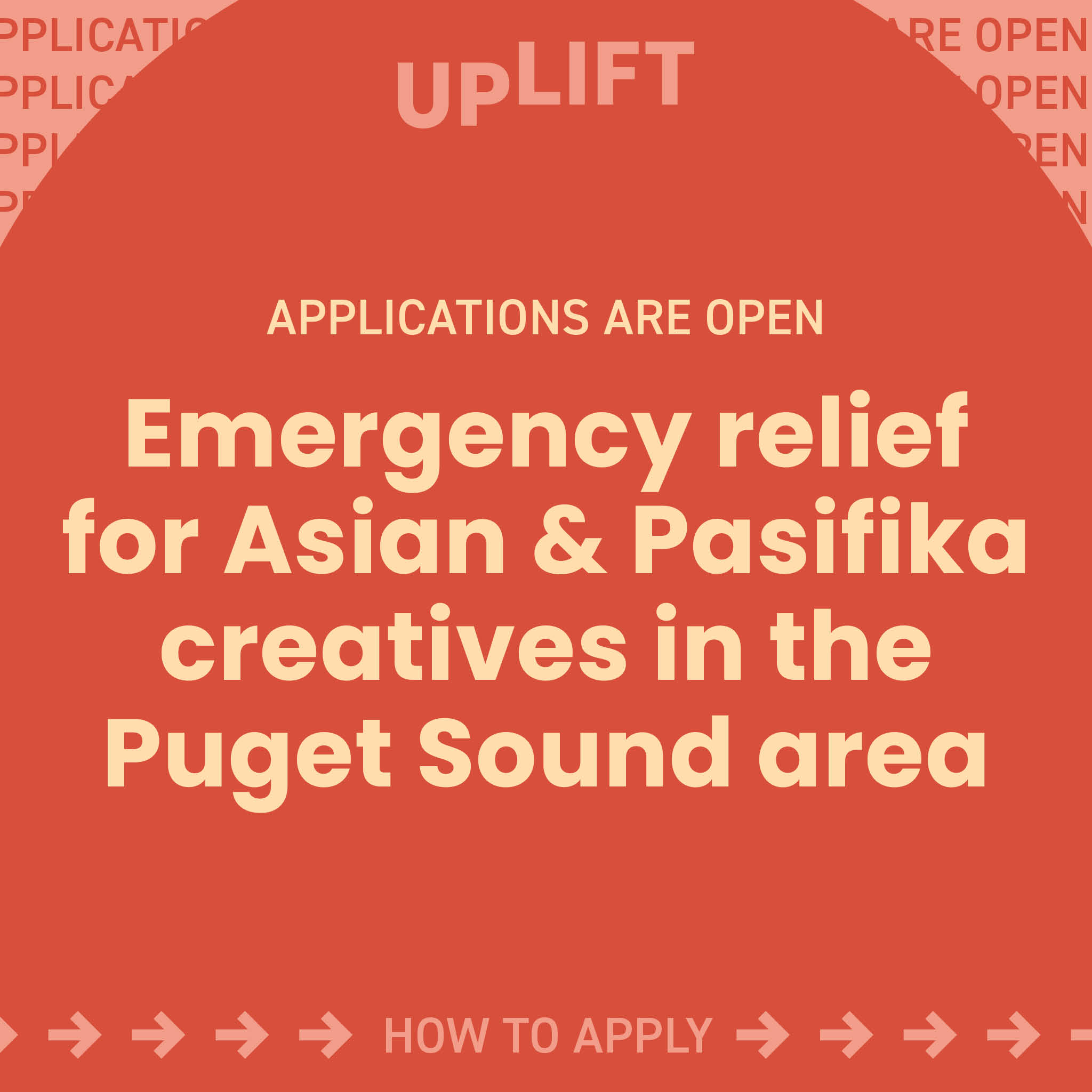
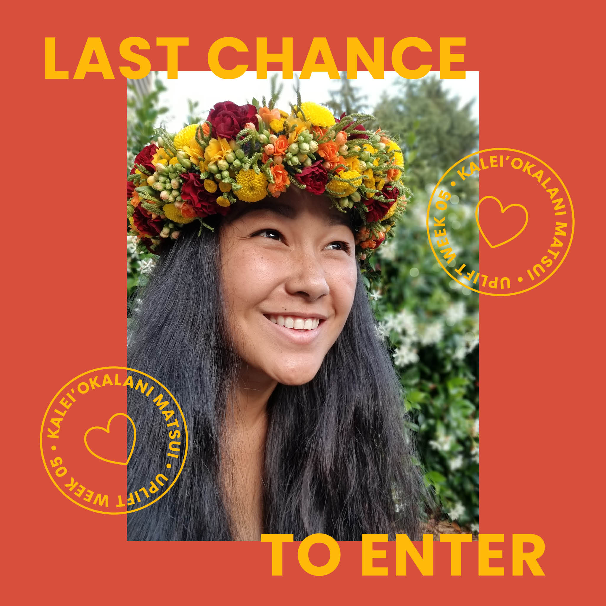
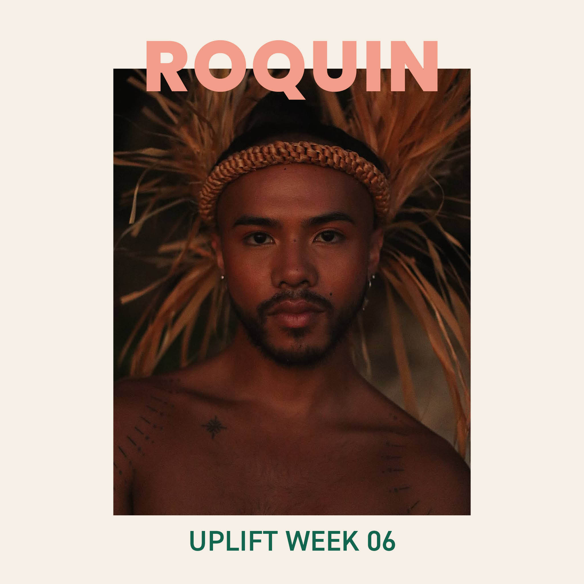
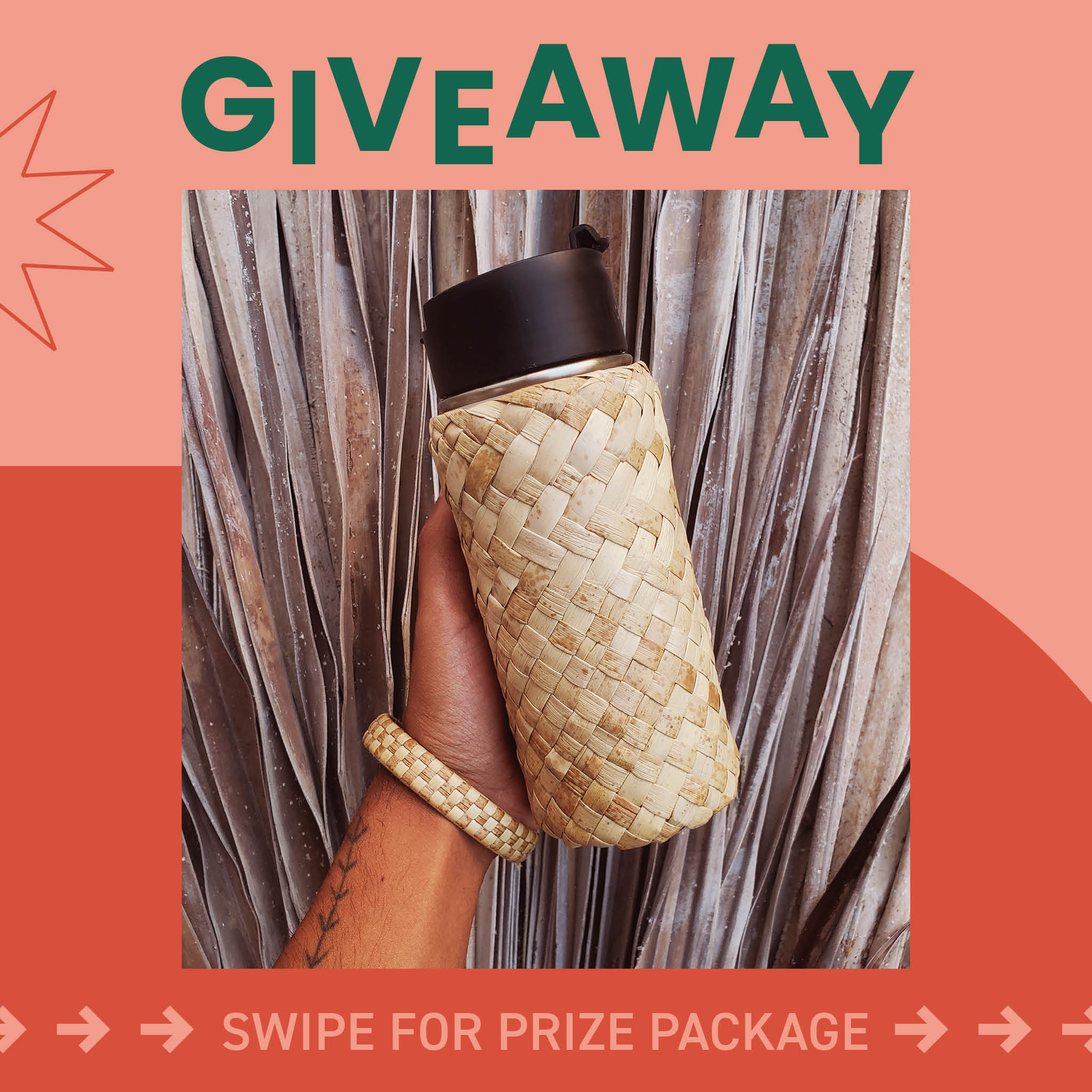
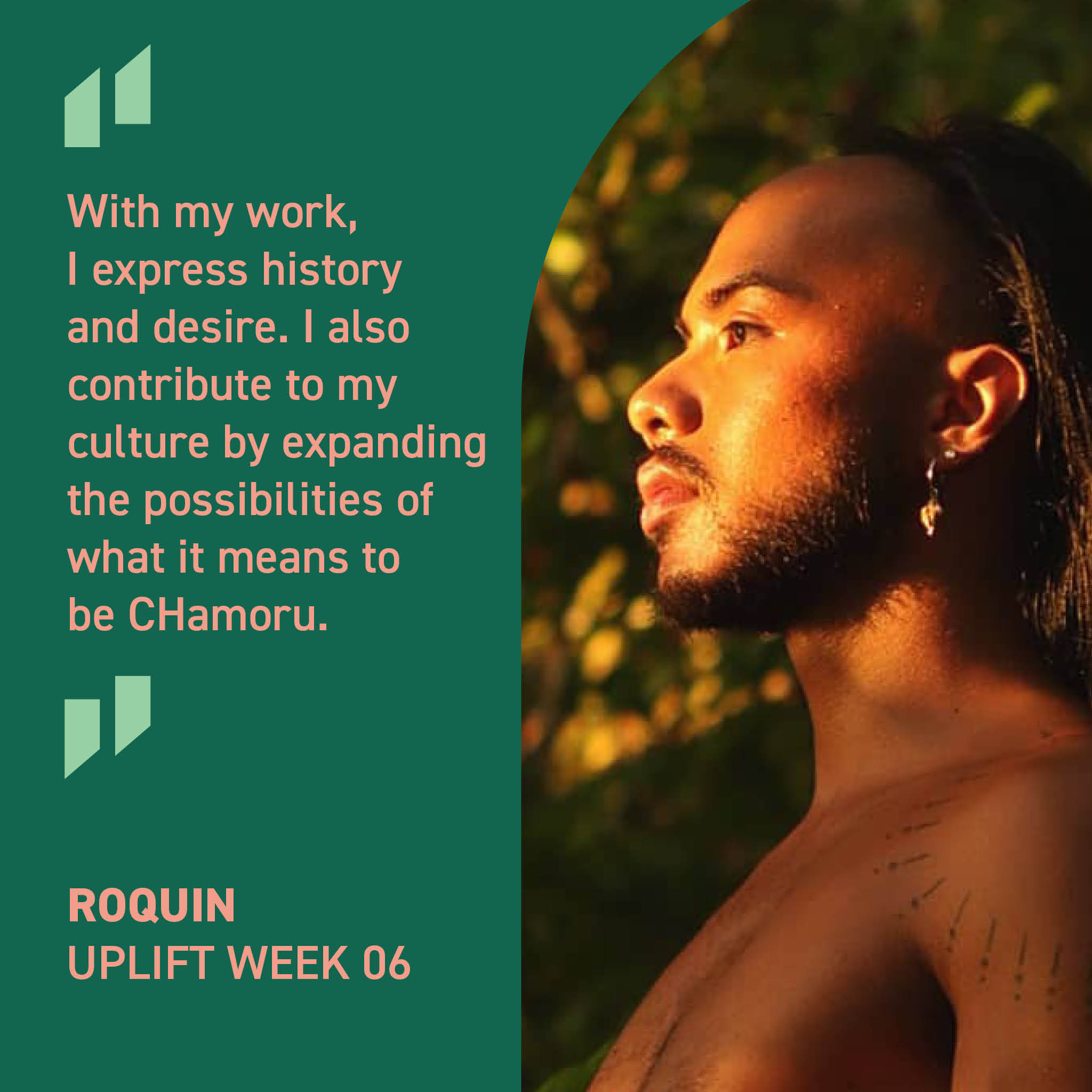
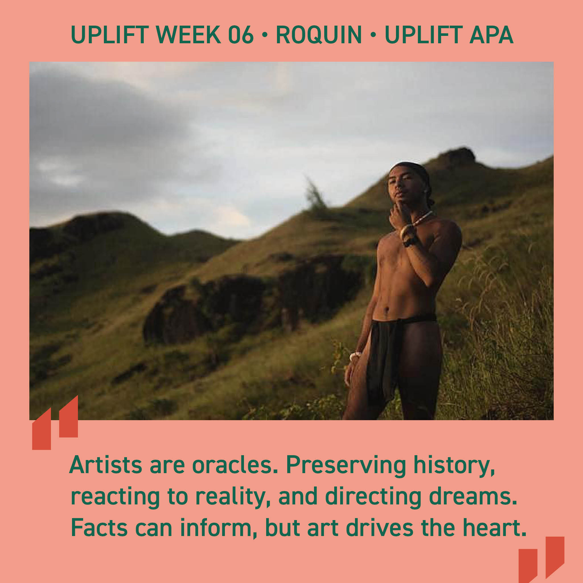
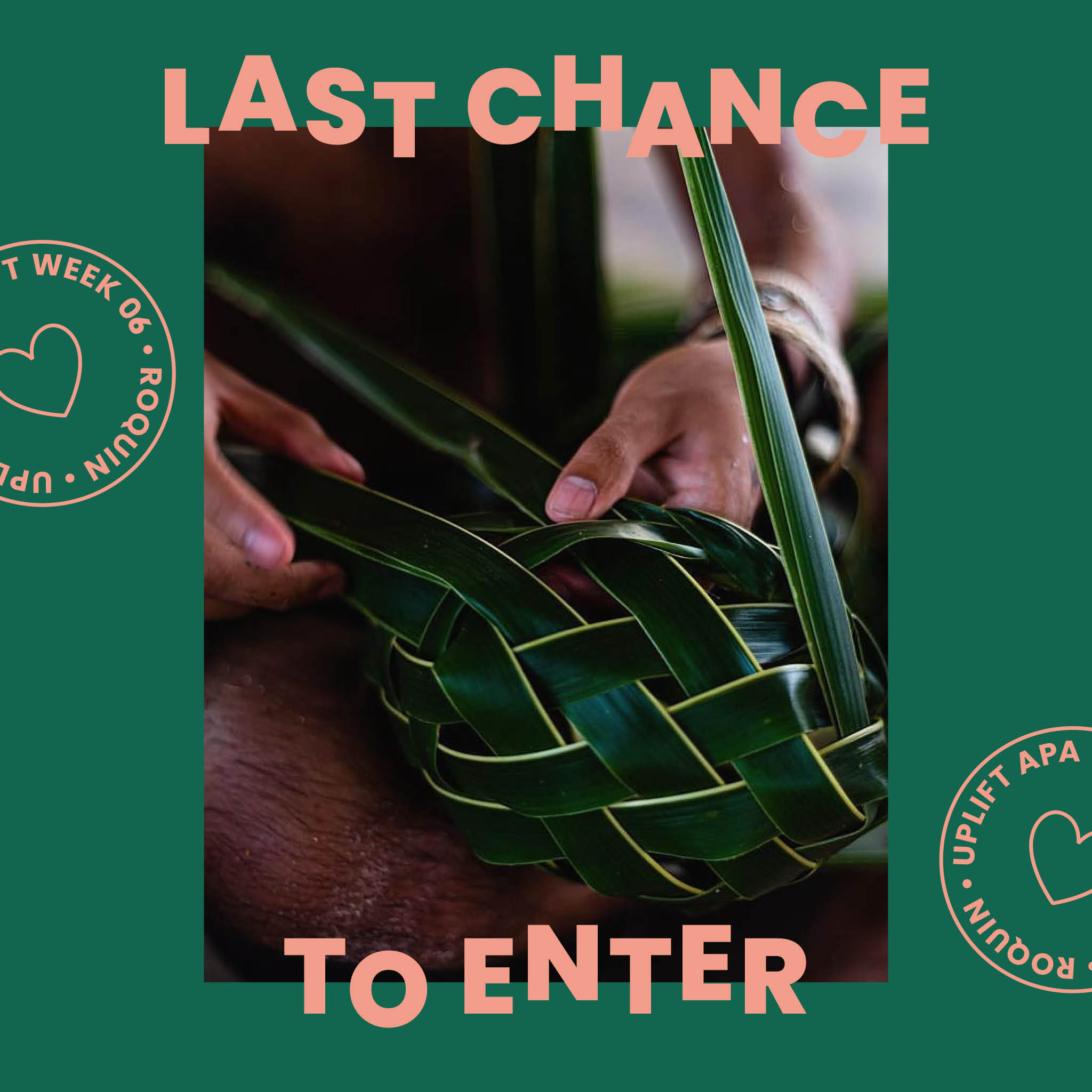
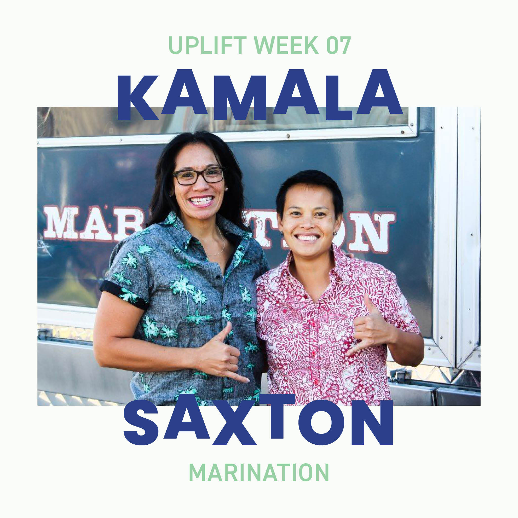
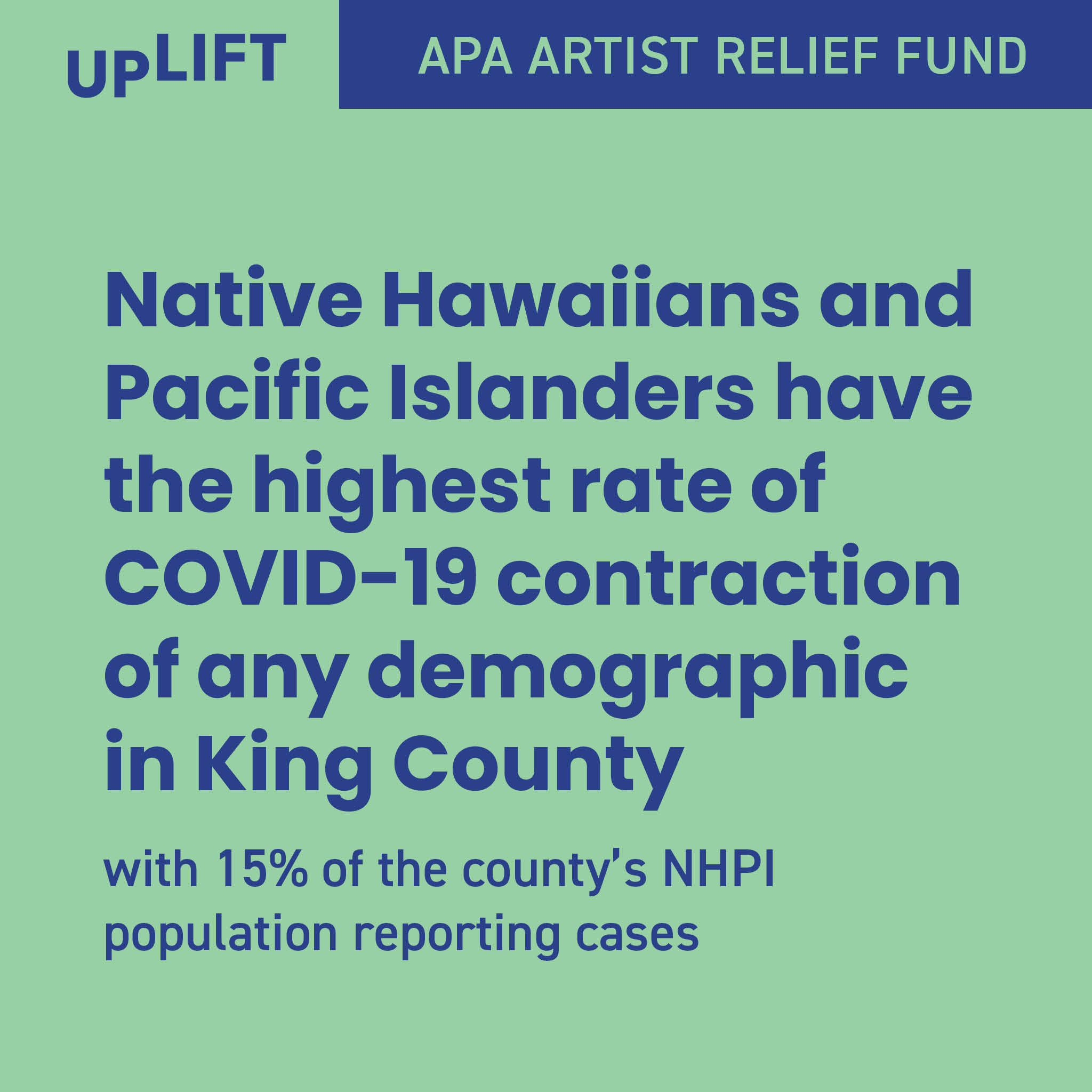
The UPLIFT Artist Relief Fund was a relief fund for APA creatives in the Puget Sound area who had been negatively impacted by the COVID-19 pandemic. I designed all branding and marketing material for the campaign and worked closely with the founder Tia Ho on content strategy. See my work at @upliftapa.
Branding
Layout
Content Strategy
The UPLIFT fund was powered by a 12-week donation-based giveaway series featuring local APA creatives and their work, with all proceeds going to the fund.
The timeline for the initial branding stage was tight, since the Instagram campaign needed to be launched soon. Tia and I came up with three words she wanted to describe UPLIFT’s brand voice: uplifting, spirited, and sophisticated.
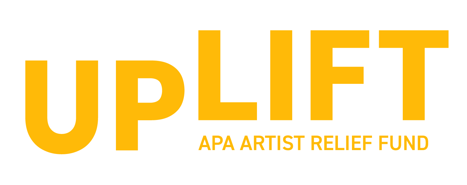
The logo is a straightforward interpretation of the word “uplift.” I chose Poppins as a base, because it is open and friendly while also being very stable. I also made modifications to open up the letterforms further. I lined up the baseline of “LIFT” with the x-height of “UP”, creating upward movement within the logo; this makes space below for “APA Artist Relief Fund,” which becomes the foundation from which the logo is being lifted.
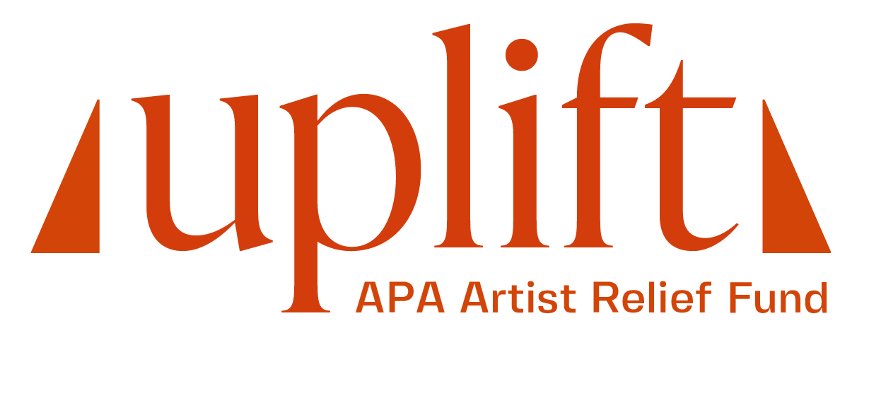
This logo option requires more context and imagination. In each Chinatown, there’s often a building that has a balcony or window that’s vibrantly framed; this would indicate that the building housed a “family association” — an organization that would help new immigrants from their respective countries. Inspired by the awning over one such balcony, I created this option; I chose a high contrast typeface to parallel the slats of the awning, and I used triangles to bolster the wordmark on either side, borrowing their angles from the typeface, and completing the roof that symbolizes a safe haven for those who need it.
The campaign needed to stand out in a social media feed, so I chose four highly saturated colors; each post would use a combination of two, with the option to use a lighter shade of a color to increase contrast.
AaBbCc
AaBbCc
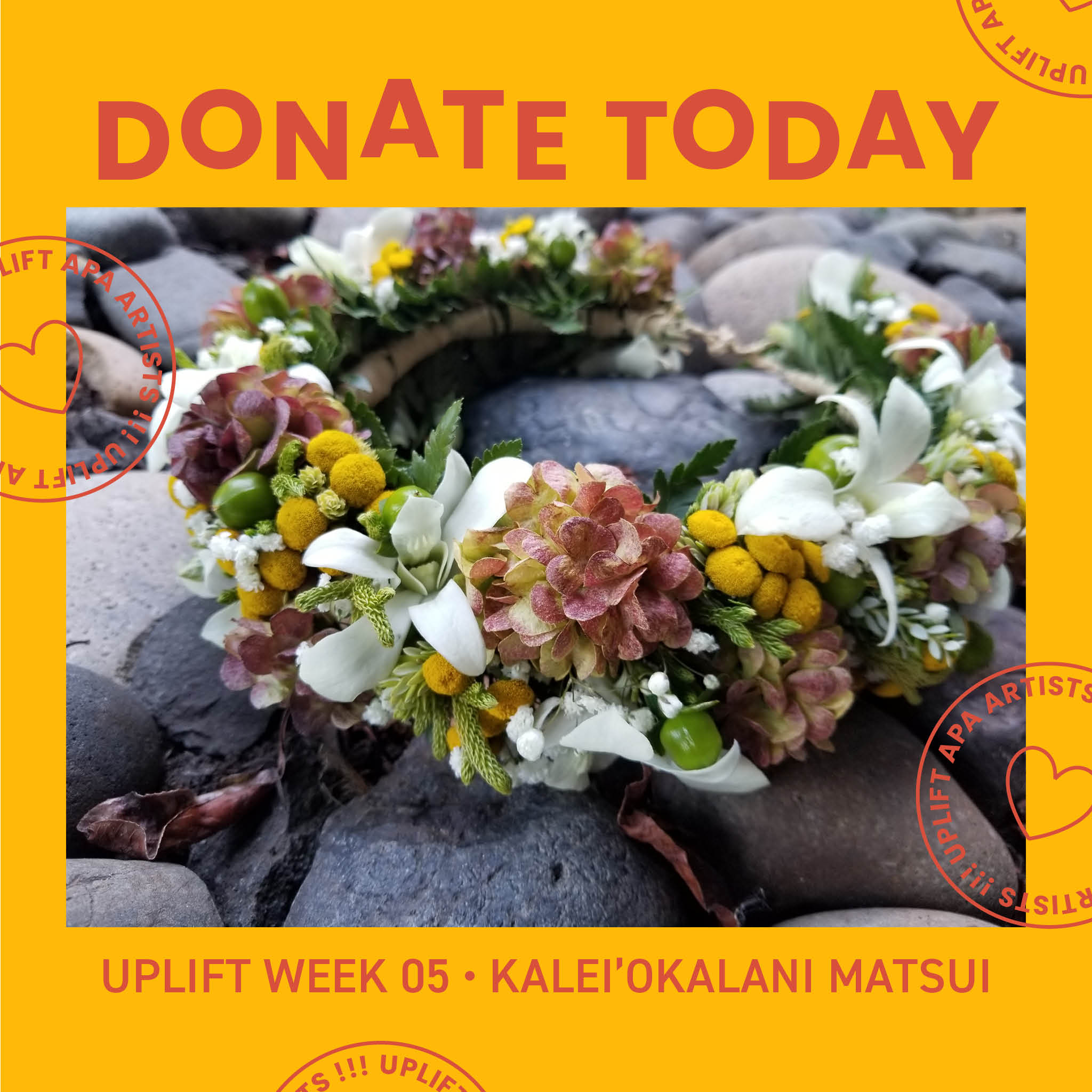
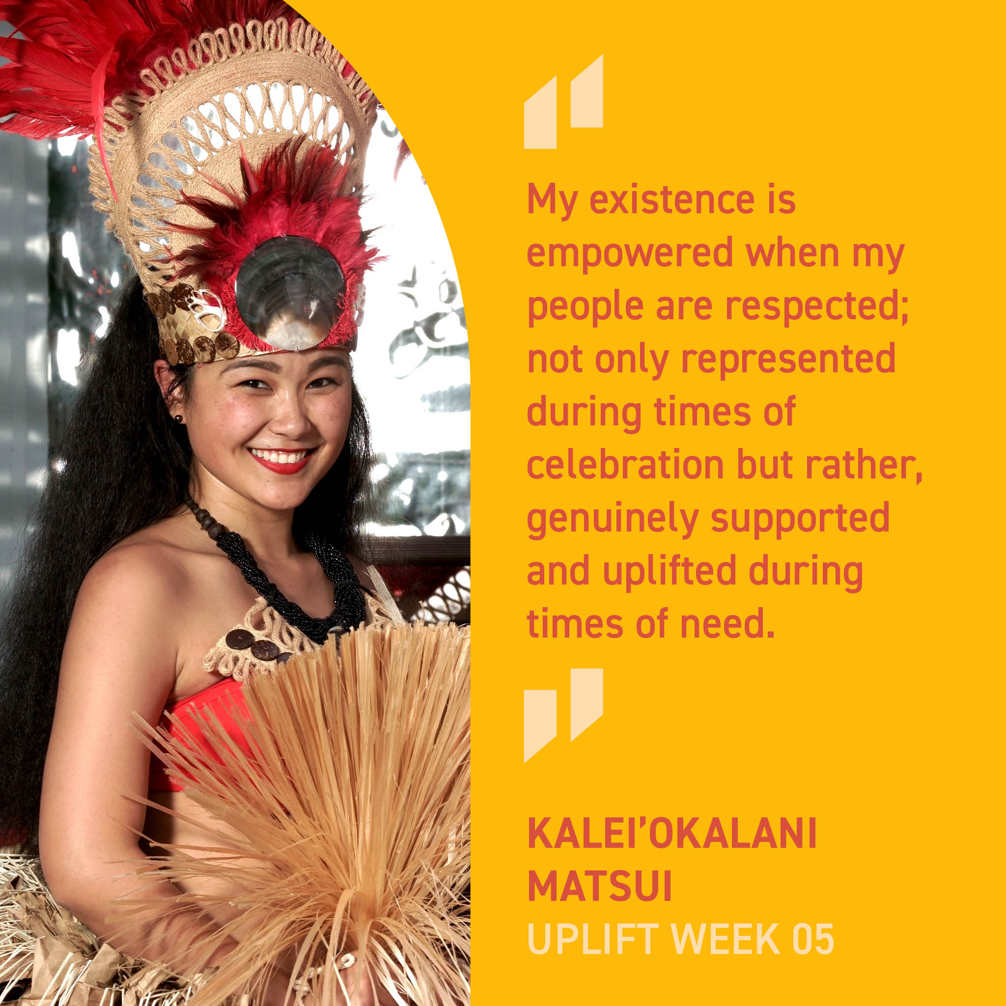
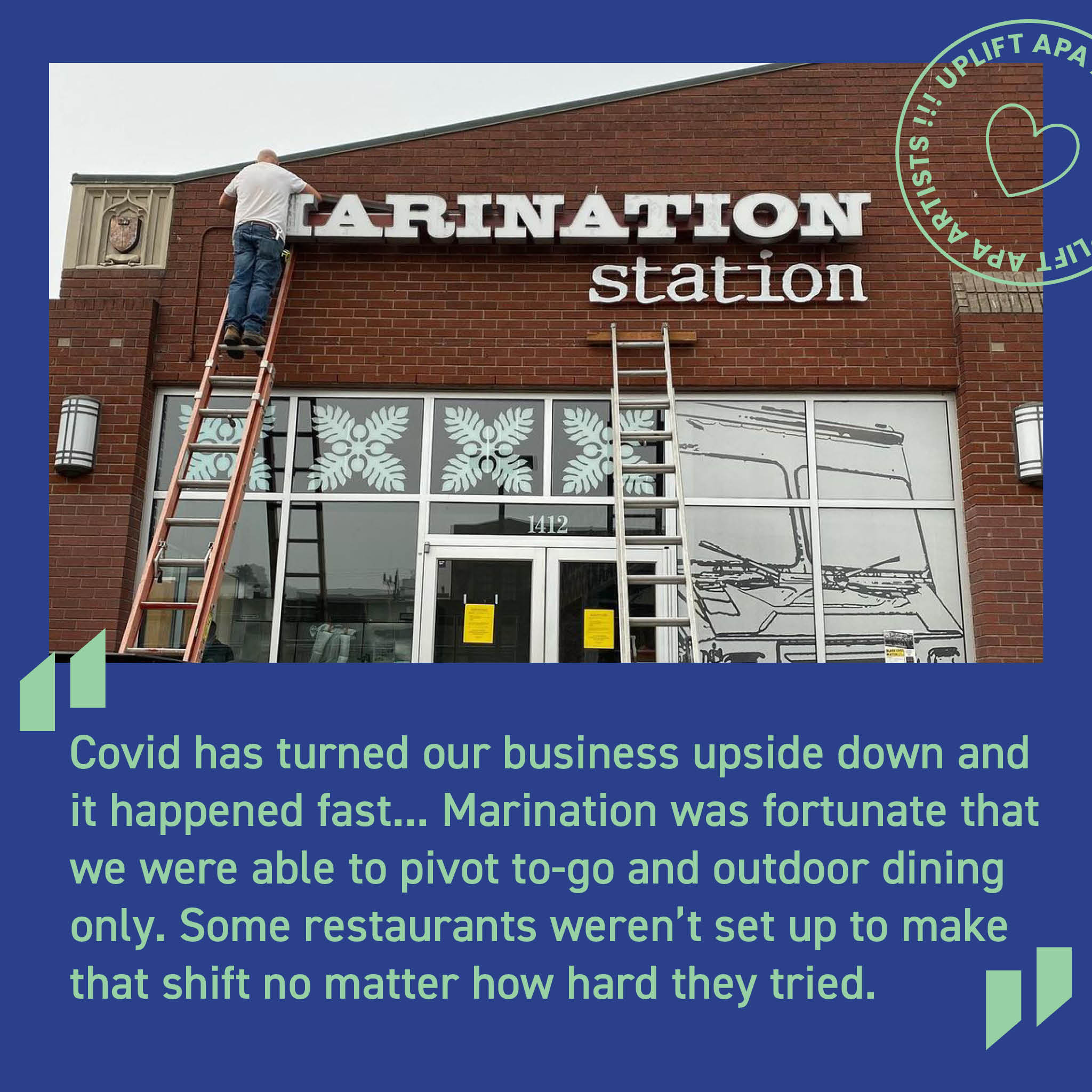
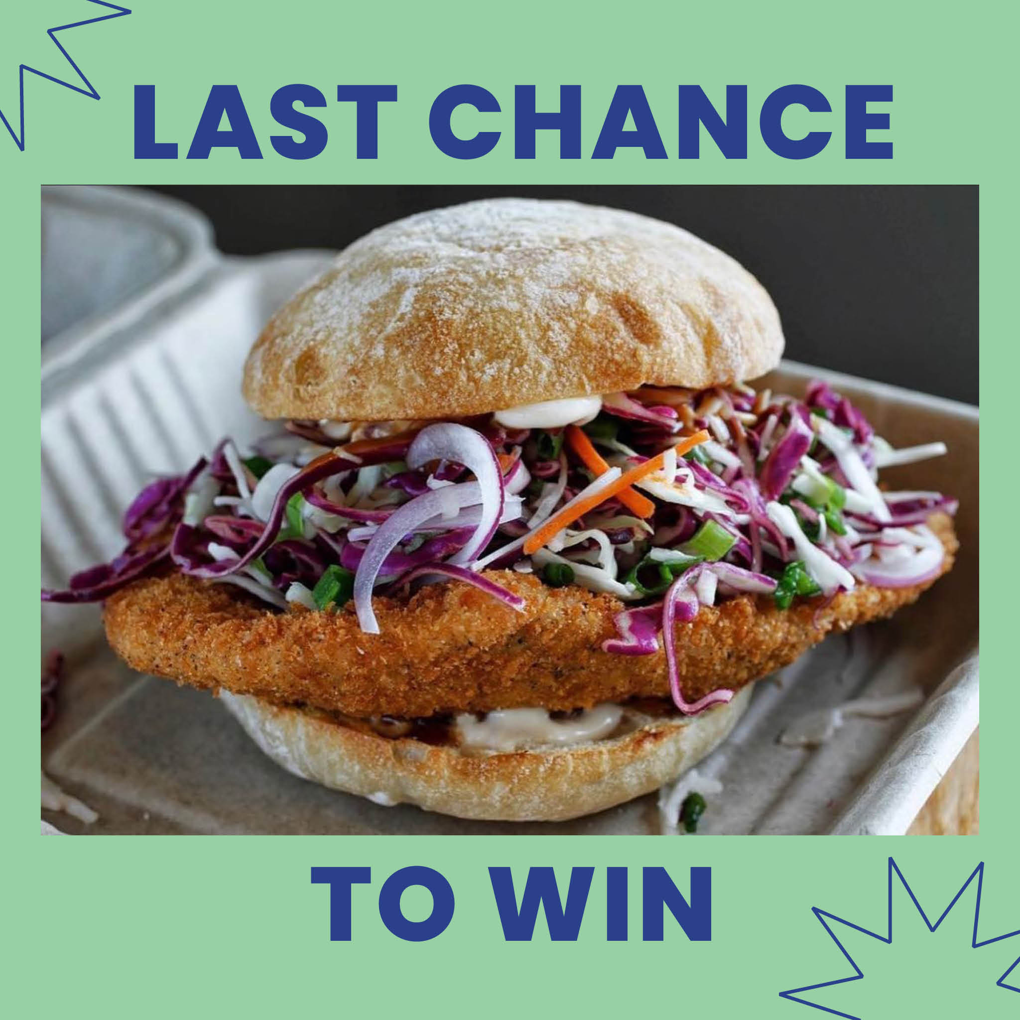
The @upliftapa profile is bright, dynamic, and eye-catching. Each artist is featured with the combination of UPLIFT brand colors that highlights their work best, and every post is custom-made, designed to maintain audience interest thoroughout the 12-week campaign. Every week, followers could expect 4-6 new posts on their feed, between the spotlight on different creatives, their quotes, fundraising calls-to-action, and prizes.