First impressions
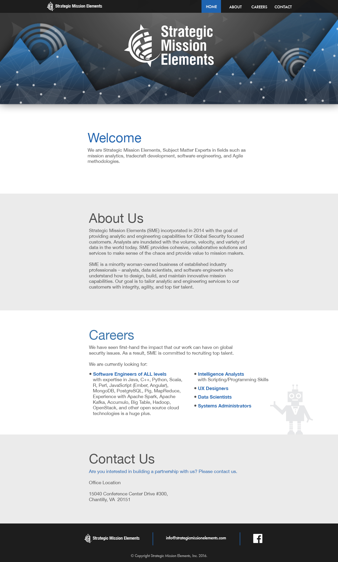
The two audiences SME wanted its website to reach were potential new hires and businesses who were interested in forming partnerships with them. When I reviewed their website, this intention wasn't immediately clear — there weren't enough actionable items for the user to follow through with. I mentioned this to the client, who agreed with my assessment and, luckily, was able to send over additional documents that I could pull information from. From these, I learned that there was so much SME did that they weren't advertising, and I resolved to showcase these capabilities more prominently in the redesign.

Brand
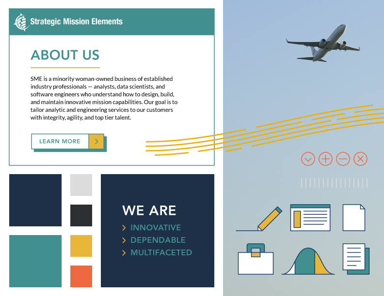
In order to make sure the visual style of the company matched its values, I ran through a branding exercise based on word association with the client, and we determined that they wanted SME to be perceived as trustworthy, knowledgeable, and innovative.
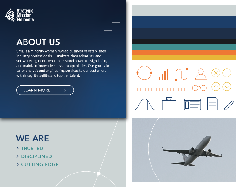
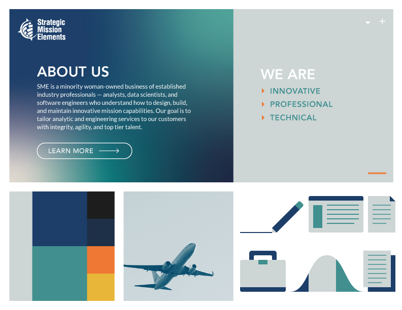
The client had also expressed some interest in keeping a similar style to some documents that they already had made, so, taking some design cues from their existing collateral and using the three brand words as an additional guideline, I presented three visual systems for the client to choose from (shown below). However, each option did involve the addition of orange and yellow to their color palette, to complement the blues and teals already present in their branding and to give the visuals more energy as a nod to their sense of innovation.
The client ultimately chose the first option, which highlighted their trustworthiness and was most similar to their existing material; they felt that showcasing their professionalism would be best, given their industry.
Wireframes
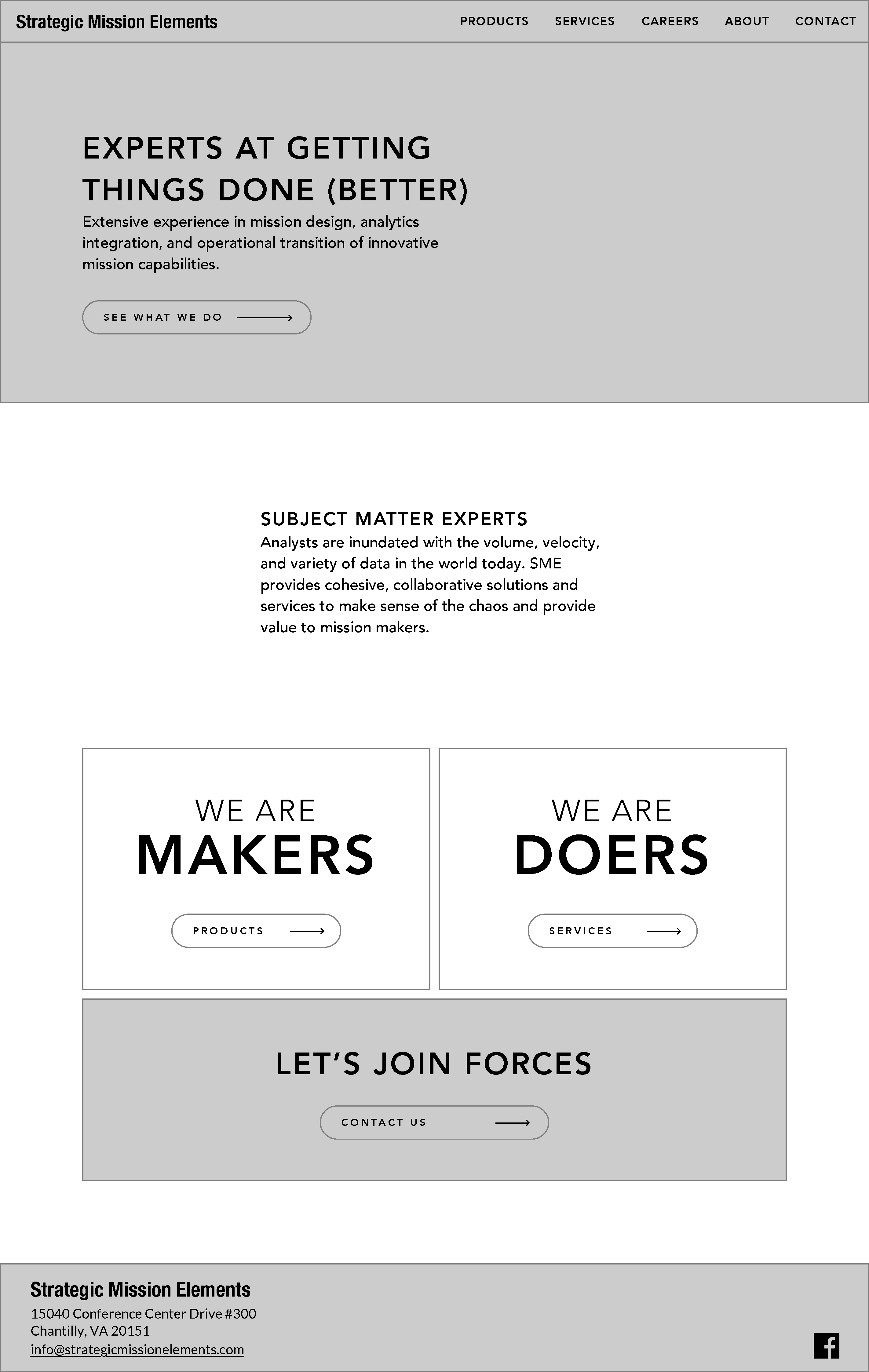
The single-page layout was limiting their content too much, so I expanded into multiple pages in order to showcase their services, products, and specific career opportunities. Since the new website was laying out so much more, new content, I felt that it was important to organize all of it into a low-fidelity wireframe first. I focused on including action-oriented language, as well as many call-to-actions.
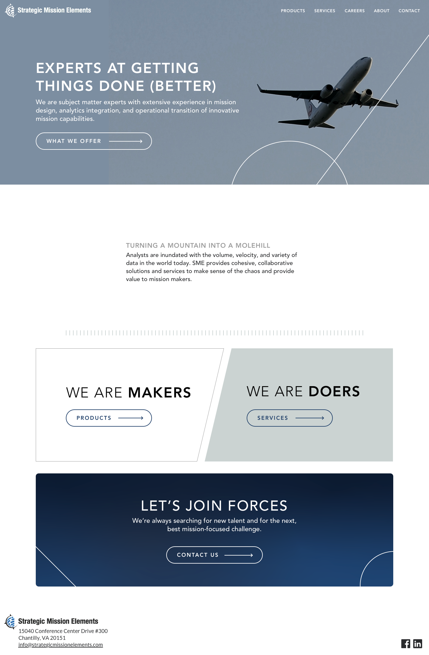
I worked in Sketch, and, because their website would be relatively static, I prototyped in Marvel. With feedback and additional content, I was able to iterate into a high-fidelity wireframe and apply the branding that would pull it all together visually.
Each of the images below link to their respective prototypes.
Website Development
One of the more complex programming challenges on this project was the increased functionality of their 'Careers' section. The client wanted to easily keep up-to-date listings of all of their job openings. Furthermore, the listings would have varying amounts of additional information, and the user needed to be able to interact with and apply for a specific role directly. These features pushed me to expand my JavaScript skills as I learned to create and modify elements based on the contents of a spreadsheet that the client would be able to edit and upload themselves.
Other skills I practiced during the development of this website were using CSS Grid to maintain a 12-column layout and using git for version control. The site is also fully responsive.
The website has shipped and is live.
