The Backstory
Min and I bonded over our struggles to define how being Asian American affected who we are, and we wished to explore those feelings as well as have an outlet for these frustrations. We wanted to tell a story, and the way the audience perceived that story was immensely important to us. So we did a lot of research and did our best to categorize sections based on why we thought they were important. Learning about history was particularly important; how did the perception of Asian Americans throughout history shape the way we were feeling right then? Our research was sobering but enlightening.
Content Strategy
Even though we were enthralled with all the information we were getting, we recognized that it could be very overwhelming, so we needed to be selective in our content curation in order for the message to shine through. However, just as important, we didn’t want to omit anything that skewed the storyline unfairly in any way. We weren't forcing people to believe anything; our aim was simply to present people with information that could spark conversations.
Website Development
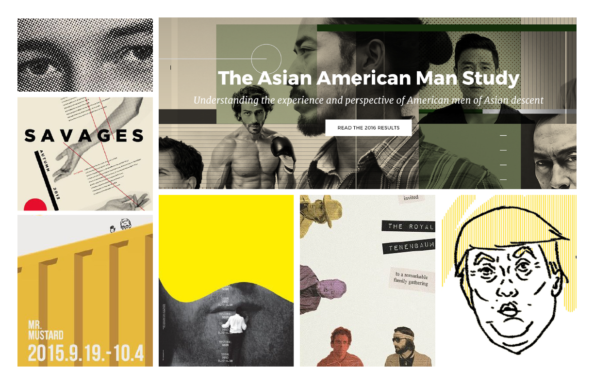
Since the purpose of this project was ultimately to convey a lot of information, I wanted the website to be clean, uncomplicated, and easy to understand; however, I also wanted the visuals to be bold and impactful and for the site to be genuinely enjoyable to interact with. I developed this site from scratch so that I could exercise more creative license, experimenting with layouts, hover states, animations, and transitions. I did not intend for this website to be anything other than a desktop experience, so the website is best viewed on a desktop.
Moving Forward
This project is deeply personal to me; it represented my struggle to understand how my identity tied into the blanket of society, and it reflected my experience as an Asian American to that point. Since then, my feelings toward my identity have grown and become more nuanced, so the website's content no longer accurately reflects my understanding of this experience; however, since the presentation of the website is highly customized to the content within it, this website is not an ongoing project.
That being said, I am extremely proud of the development of this website, as well as of Min and myself for having the courage to explore our stories.


