A number of new initiatives sprouted during my time at Cultivate Learning: a podcast for early childhood educators, a new center within the University of Washington, and a program that focuses on supporting African American boys.
Logo design
Parallel Play is a podcast where educators discuss practical teaching strategies, developmental progressions, and the joys of toddlerhood. They needed a logo that would capture that passion and engagement while adhering to the NCECDTL design system. Initially meant to go hand-in-hand with an existing webinar series, I used that webinar’s tree logo as a starting point to explore concepts such as sprouting, nesting, chirping, and birds.
The resulting logo features two birds, facing each other and interacting, amidst leaves and surrounded by headphones. The birds are composed of simple shapes: oviform, circular, and triangular. The headphones use the same oviform shape as was used in the birds, and the leaf shape is borrowed from the logo this webinar was intended to partner with. The circular leaf arrangement forms a nurturing nest, symbolizing growth and vibrancy. As a nod to the toddler-friendly atmosphere, I rounded the edges off all corners. The color palette exclusively draws from the DTL colors, with darker shades grounding the central birds and lighter hues encompassing them, creating a welcoming, safe space.
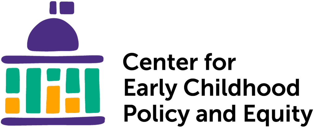
The Center for Early Childhood Policy and Equity wanted a logo that was academic, as the key demographic is graduate students and university faculty, as well as representative of the key ideas in their name: early childhood, policy, and equity. I was inspired by this image, showcasing the difference between equity and equality. I simplified the idea down to blocks and noted how, stacked, the blocks became pillars; these pillars become the pillars for a capitol building, also built from simple shapes.
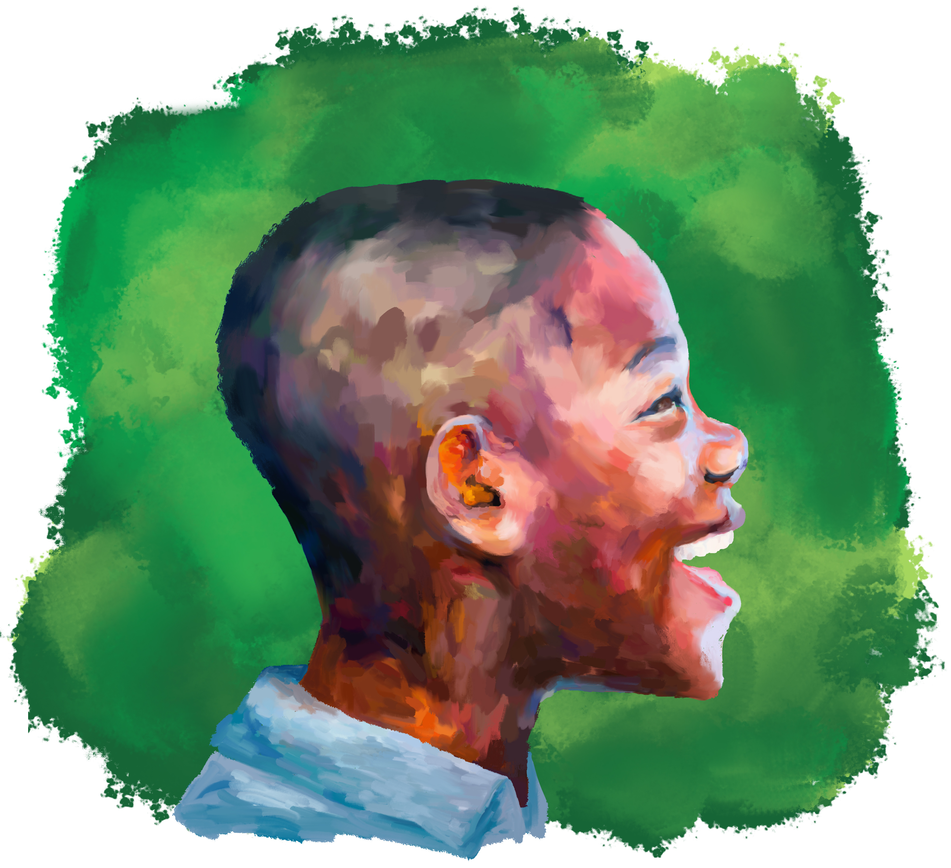
My goal was to capture the essence of “black boy joy” in the logo design, while also being mindful of avoiding any imagery that could be associated with negative stereotypes. To inspire my creative process, I drew inspiration from impactful logos like the raised fist emblem popularized by the Black Lives Matter movement, as well as educational logos and children's art.
During my research, I stumbled upon the book I Am Every Good Thing. Gordon James’ illustrations paired with Derrick Barnes’s message was exactly what I wanted to convey, and I abandoned the idea of symbolic imagery and clean cut vector files in favor of a painted style and the beautiful, happy faces of beautiful, happy black boys.
I used Dall-E, an A.I. image generator, to generate a base portrait, then chose to digitally reproduce the portrait with oil paints to showcase its energy and depth. The resulting logo was accepted with unanimous and enthusiastic approval from the project’s large committee.
While the logo is a fairly large departure from the NCECDTL design system in terms of style, I incorporated the brand colors into the background and the boy’s shirt and kept the overall image fairly simple.