Our City
People from all over the world are flocking to Seattle and calling it home. Sound Transit, by providing affordable and accessible transportation all over the city, is letting people lay claim to it, giving you independence and agency. And as you bustle about your "part of town" or as you go out to explore new ones, you become part of the city as you learn about and grow with it. It becomes your Seattle.
Concept: Your Seattle.
Logo
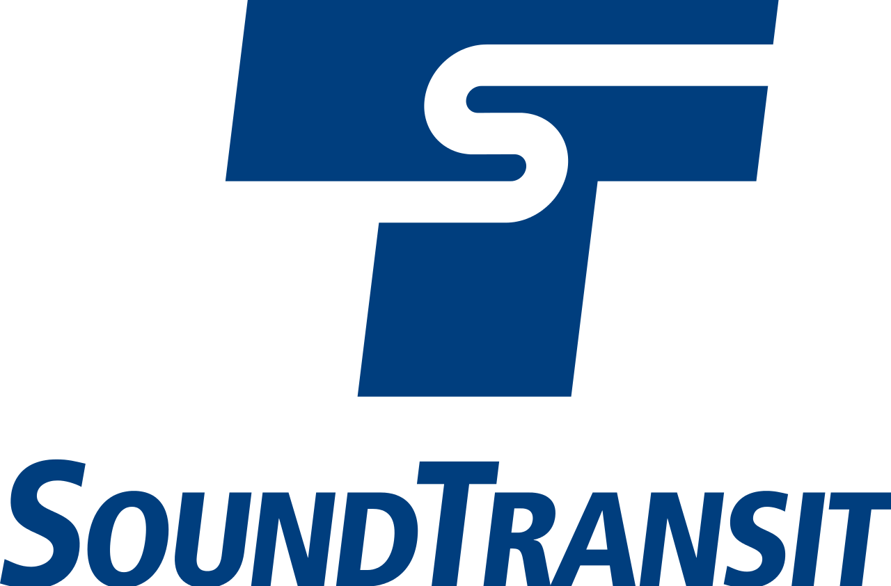
The current Sound Transit logo, with its rounded S embedded in an italic T, is familiar to all Seattlites. The new logo builds off of that, because the city certainly doesn't need more drastic change. Our concept is rooted in the community and familiarity and the people who live in these neighborhoods. We need to come together, and so Cole and I made some changes to reflect that. The S is now encased in a friendly circle, and using Rubik as a base for the wordmark, the type has been tracked out and rounded to feel more relaxed and welcoming. "Sound" has remained a heavier weight because of our focus on community, while "Transit" has maintained the italics to show that we're not just a friendly face; we're a transit company, and we know you have places to go.
Color
Seattle’s traditional pairing of teal and blue feature prominently in the color palette. They are, after all, proudly representing the Seattle region, and the colors, like the tranquil waters that surround the city, evoke a sense of calm and trust that every rider can expect.
An energetic orange and warm yellow complement the cool primary colors with their vibrant glow, a celebration of the sunny days that we’re always so grateful for here in Seattle and a testament to the vibrancy of the community we live in.
Patterns
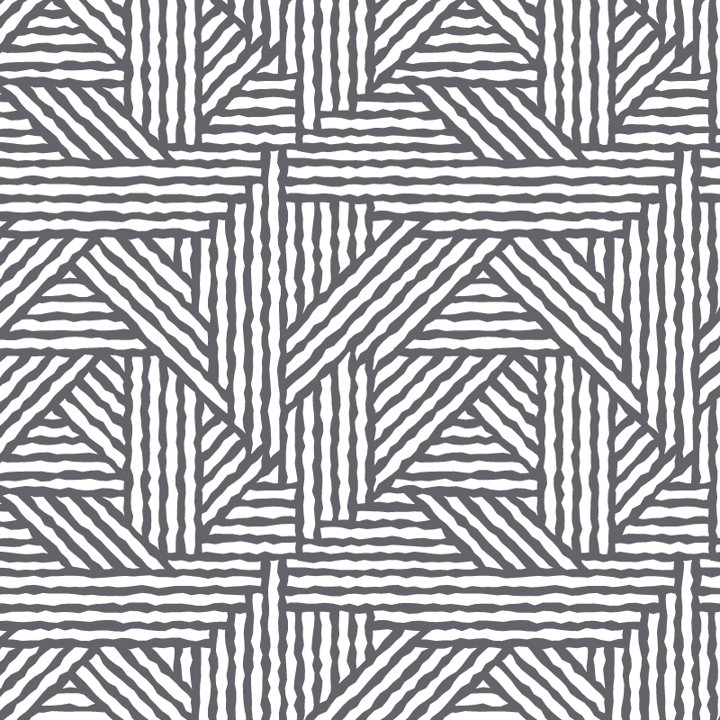
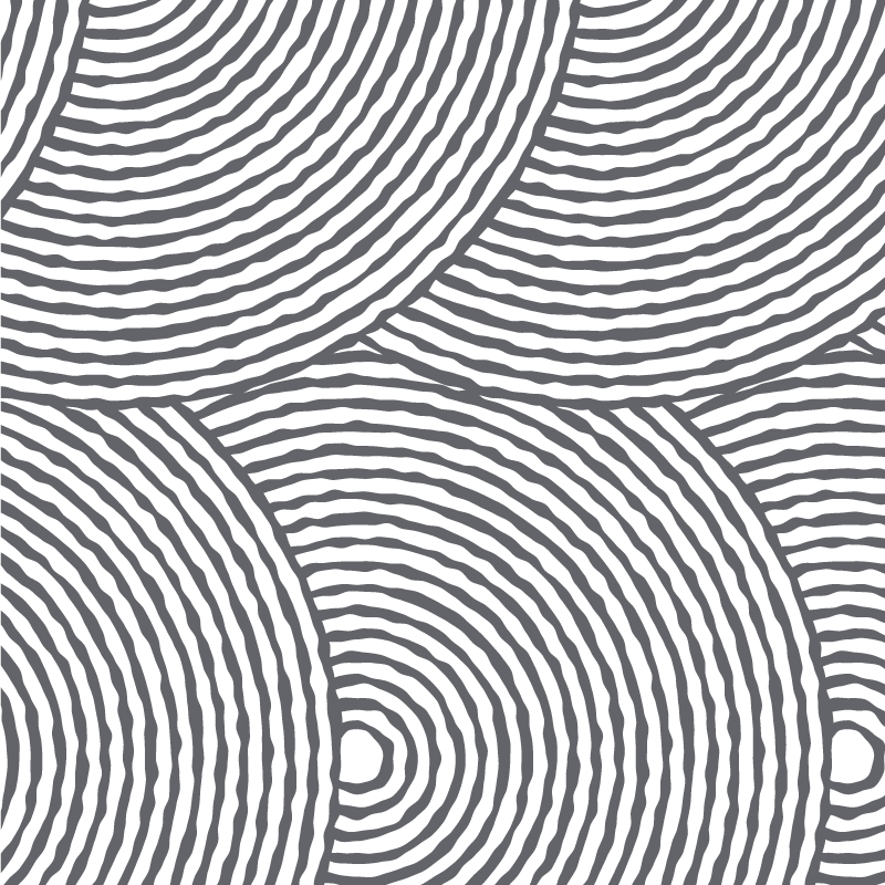
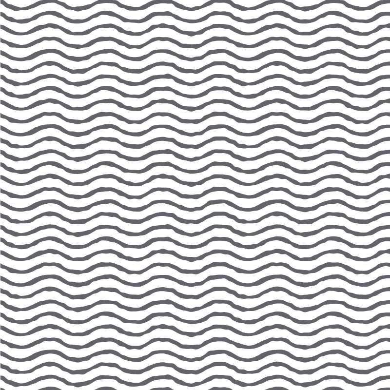
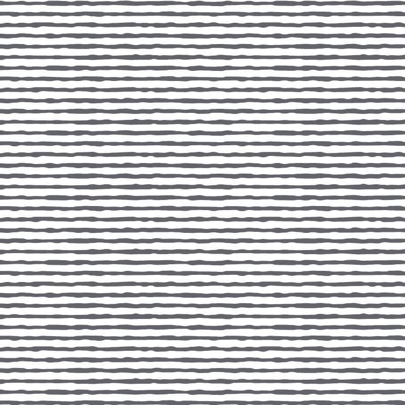
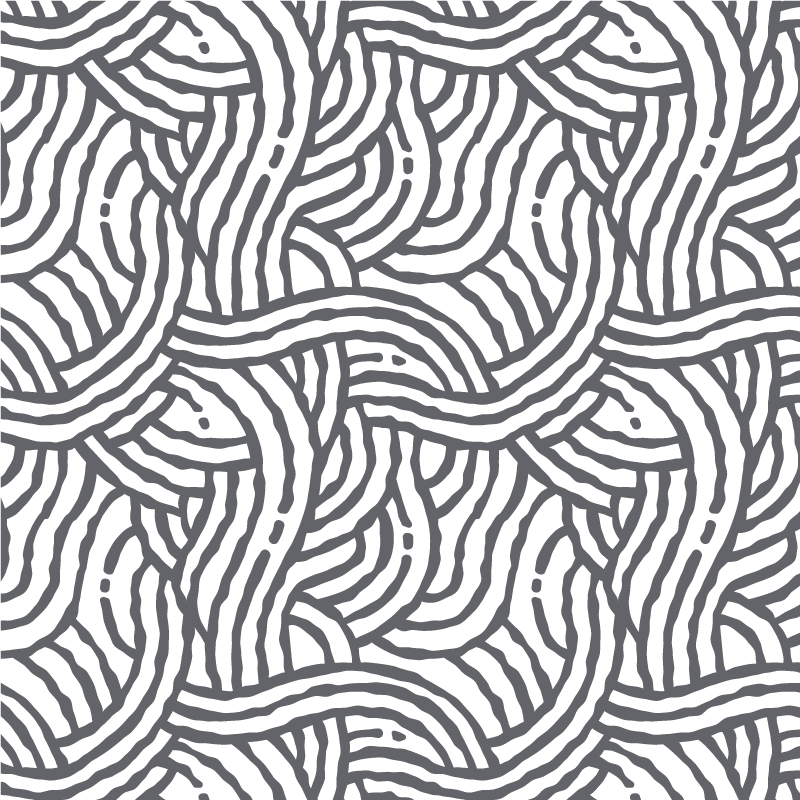
Our patterns provide texture to our brand, representing the diversity of the remarkable community we serve.
The patterns themselves are orderly and systematic with a medium line weight, giving a feeling of stability without seeming very heavy. The rough texture of the lines brings the patterns to life, adding charm with their inexact rendering.
Graphic Elements
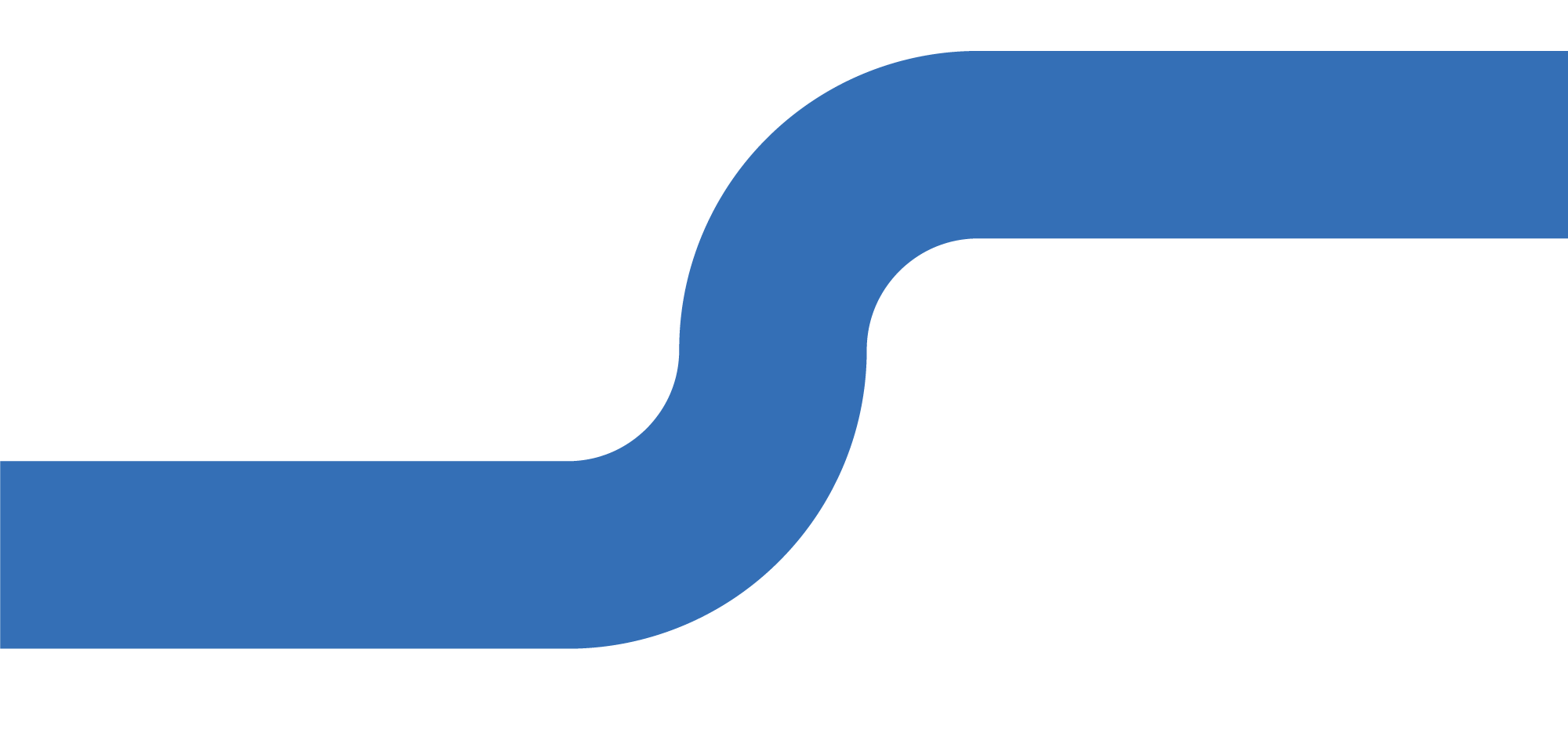
Our brand utilizes big, bold, round, geometric curves. This element is reminiscent of the simple curves of our logo, that are soft but also stable and predictable.
Additionally, the usage of a simplified map grid represents the vibrant Seattle landscape that Sound Transit helps riders discover and traverse.
Typography
AaBbCc
Rubik Medium: Stable and consistent. Used for headings. Lighter weights may be used for subheadings.
AaBbCc
Lato: Simple, straightforward, and easy-to-read. Used for body copy.
